


EPIC CAPITAL MANAGEMENT | WESBITE REDESGIN
THE STORY:
Epic Capital Management is a boutique financial management company based in Toronto. The firm was established in 2000 and has consistently offered investors an innovative and unique approach to managing their portfolios.
In Fall 2022, Epic began to recruit for new investors and approached me to assist with marketing strategies and the redesign of their website. My role included extensive research on the company and its customer base, analysis of the original website, ideation of multiple solutions, prototyping, and usability testing. The project was a huge success and achieved a 390% increase in user interactions within the first month of its launch.
TIMELINE
Nov 2022 - Jan 2023
ROLE
-
User Research
-
Rebranding Strategy
-
Visual / UI Design
-
Prototyping
-
User Testing
THE PROBLEM
Existing website suffers from outdated content and visuals that do not effectively communicate the company's products, leading to low user engagement.
THE GOAL
Revitalize Epic's online presence and attract new investors by redesigning their website with modern features and an intuitive user flow.
DESIGN PROCESS
RESEARCH
IDEATE
PROTOTYPE
TEST
DESIGN RESEARCH
To gain a comprehensive understanding of the client's needs and goals for their website redesign, we kicked off the design process with an in-depth 1-on-1 interview. During our discussion, I asked a series of big questions to uncover the most important challenges that needed to be addressed.
"What is the main objective behind the website redesign?"
"What primary business metric are we optimizing for? how we will measure success?"
"Can you describe your company's branding and how it should be reflected on the website?"
"How would you like your users to feel when they land on your page?"
Through my user research and analysis of the original website, I identified three pain points that significantly contribute to a poor user experience.
1. The website currently contains redundant information and clutter that contribute to a high user bounce rate, with users frequently closing the webpage without exploring the full site.
2. The content on the website is outdated and contains inaccuracies, affecting the reliability of the information presented.
3. The website has not received adequate maintenance over the years, resulting in glitches and graphic issues that detrimentally affect both functionality and visual appeal.
ORIGINAL WEBSITE ANALYSIS

A series of irrelevant hero images that are not fitting to the brand

Random elements floating on pages
Outdated content

Oversized images
Overall poor UX and UI design
IDEATE
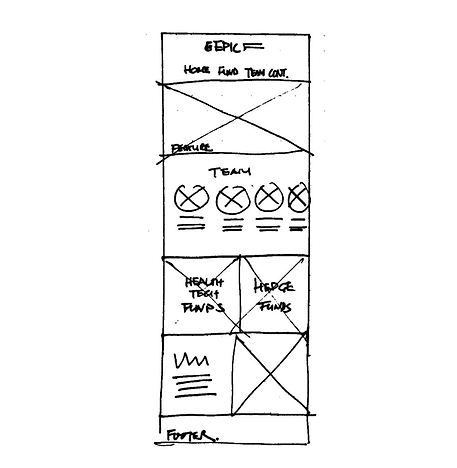
I came up with three design solutions that best represented the client's vision and precedents. Typically, my ideation process starts with lo-fi wireframe sketches, and I refrain from going into hi-fi mockups until insights are informed and design have been workshopped. However, the client requested visual representations of each design solution before proceeding with refined development. The carousels below showcase both the lo-fi sketches and what I consider mid-fi mockups for each design solution.
Option 1
Why: This option is designed as an upgraded version of the original website, reconstruct familiar elements while introducing new content for an elevated user experience.
Option 2
Why: This option is designed based on the client's preferred precedent, featuring a fixed left-hand side menu for intuitive navigation.

Option 3
Why: During the user research phase, there was a strong insight on employing single-column layouts to logically organize elements, ensuring a clean and intuitive user flow.

STICKER SHEET
We proceeded to refine the development of Option 3 into Hi-Fi prototype for its clean aesthetics and effective user flow. The design sheet showcases EPIC's signature colours and fonts, ensuring consistency in company branding and identity.
COLOUR PALETTE

Colour 1 | 70%

Colour 2 | 20%

Colour 3 | 10%
Specialty Colour | Homepage

BUTTONS
TYPOGRAPHY
Heading 1
Georgia 38
Heading 2
DIN Next Light Bold 38
Paragraph 1
DIN Next Light Bold 21
Paragraph 2
DIN Next Light 18
Paragraph 3
DIN Next Light 15
HI-FIDELITY PROTOTYPE
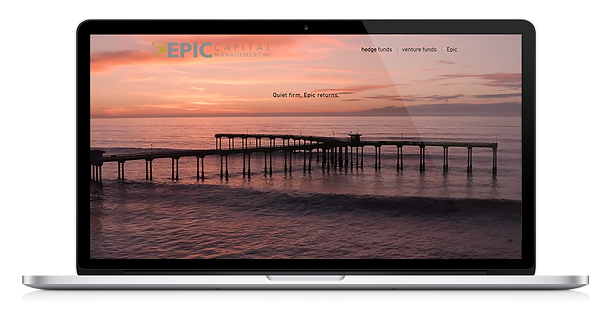
Homepage
Clean and intuitive, help users easily find their next destination.

Funds
Discover and learn about Epic's products and services.

Epic
Learn about the history and meet the team behind Epic.
CONCLUSION
The project was a success, as the revitalization of the website proved to be a highly effective marketing tool - it achieved a 390% increase in use interaction within the first month it was launched and has since brought in new investors to Epic.