


HOW I REDESIGNED MY FIRST UX PROJECT:
THE HAPPY FLORIST
THE STORY:
The Happy Florist was the first UX project I designed for my google certification. My goal for the boutique flower shop was to understand both the business objectives and user needs. While most of the store’s customers are from its local neighborhood, the aim is to expand its clientele to the broader city. In pursuit of this goal, I recognized that introducing a digital app for pick-up and delivery services would be a key solution.
The initial prototype was completed in early 2022. However, after gaining two years of hands-on experience and collecting feedback from industry peers, I saw an opportunity to redesign the product to better meet user expectations and stand out in a today's design market. Prototype 2.0 now integrates improved UX/UI design principles, including typography hierarchy, color theory, layout alignments, and core UX laws
TIMELINE
Feb 2022 - May 2022,
April 2024
ROLE
-
User Research
-
Information Architecture
-
Wireframing
-
Prototyping
-
Visual Design
-
User Testing
THE CHALLENGE
Prototype 1.0 featured weak design elements that did not meet high industry standards due to limited experience and skills in design principles.
THE SOLUTION
Gain expertise in design principles and 'UX Laws' through freelancing and pro-bono experiences, then incorporate feedback from industry peers to redesign Prototype 2.0.
DESGIN PROCESS
Research
Interview
Persona
User Journey
Ideate
User Flow
Sketches
Lo-Fi Wireframes
Prototype
Hi-Fi Mockups
Prototyping
Review
Usability Testing
Critique Sessions
Gain Experience
Redesign
Wireframing 2.0
Prototyping 2.0
User Testing 2.0
INITIAL RESEARCH
To kick off the project, I engaged 10 of my friends who regularly shop for flowers, spanning ages 25 to 45, to explore their attitudes towards mobile ordering. Additionally, I interviewed a staff from my local florist to understand their business perspectives. This diverse group provided real insights into both buyer and seller behavior and preferences.

RESEARCH GUIDE
Research results reveals that 61% of users prefer to purchase flowers in-person. Fortunately, the majority of users shop locally, which aligns with our objectives. An opportunity to explore is how might we motivate and incentivize users to use mobile apps for ordering flowers.
Where do you typically purchase flowers?
In-person, at a florist
21%
In-person, grocery stores
33%
In-person, nursery/farm
7%
Online, local shops
19%
Online, international
16%
Phone orders
11%
Other
3%
What factors are most important to you when purchasing flowers?
(each participant may provide up to 3 answers)
Price
8
Flower type
7
Easy to care
6
Lifespan
6
Visual appearance
5
Occasions
5
Symbolic
4
Depends on the day
2
No preference
1
How frequently do you purchase flowers?
Once a week
2
More than once a month
2
Once a month
1
Less than once a month
1
Only on occasions
3
I don't keep track
1
PAIN POINTS
Schedule
Flower shops commonly closes at 6pm, but many working adults finish work at 5:30pm, leaving them feeling rushed and stressed when shopping for flowers.
Inventory
Shoppers are often frustrated when they discover that the specific type of flower they are seeking is out of stock upon visiting the shop.
Personalization
Many users struggle to customize their bouquet through digital platforms or phone orders.
PERSONAS


USER JOURNEY MAP

DEFINE GOALS

USER FLOW

Action
Screen
Decision
CONCEPTUAL SKETCHES
I began ideating design solutions by sketching out paper wireframes, which were then translated into digital low-fidelity wireframes using Figma.


LO-FI PROTOTYPE
Once all the key frames are develop, I made a quick interactive prototype in Figma by incorporating clickable buttons, navigational links, and animated transitions. The lo-fi app simulation was used as a first round of quick solo testing to help identify potential design flaws and opportunities to improve user flow.

PROTOTYPE VERSION 1
It's time to take my design to the next level by going Hi-Fi. This was essentially a major submission for my UX courses.


PROTOTYPE VERSION 2
After two years of gaining real-life experience and receiving feedback from industry leaders, I've advanced my skills in design principles, including layouts, alignment, hierarchy, color contrast, and the use of negative space. I have also developed an interest in learning the Law of UX to incorporate it into my design. My growth has inspired me to revisit and redesign my first-ever UX project.
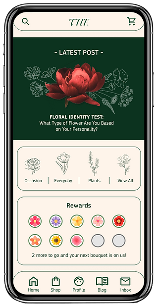
Home Screen:
Displays a welcoming interface with key features to help users navigate to their next destination.

FLOWER CATELOGUE:
Allow users to explore a variety of flower that the store offers with filtering options.

FLOWER DETAIL:
Provides detailed information about each flower, and the option to customize your flower before adding to cart.

FLORIST'S BLOG:
Offers access to informative and engaging content from the florist, such as tips, trends, and floral arrangements inspiration.

VIEW ORDER:
Shows a summary of current or past orders, including order status and delivery information.
WHAT REALLY CHANGED?

Accessibility: The background was changed from high luminance white to a softer off-white to reduce eye strain and improve readability.
Typography: Improving the use of font weights, sizes, and styles helps create a visual hierarchy that guides users' attention and emphasizes important information.
Gestalt Principles: Grouping similar elements together using visual cues like proximity and borders to reduce cognitive load and helps users to focus on their tasks or goals within the interface.
Overall UI Design: Create consistent UI elements and design patterns throughout the product with proper hierarchy, typography choices, and spacing to enhance overall visual appeal for users.
Overall UX Design: Improved the app's navigation based on user testing feedback and created a more linear and smoother checkout experience.
CONCLUSION
My journey in redesigning the Happy Florist stands for the iterative nature of UX design. Starting with an initial prototype that fell short of industry standards, I embraced continual learning and growth fueled by real-life experience, seeking feedback, and a commitment to refining my skills and understanding of UX design principles, ultimately leading to the development of Prototype 2.0 that addresses key pain points and improves overall user experience. In conclusion, this project not only showcases the elevation of a prototype but also reflects my evolution as a UX designer ready to tackle challenging work and craft meaningful user experiences in today's UX design landscape.